Thursday, April 28, 2011

pinwheel folded flyers


Before coming across this wicked ass design for for a book store I wanted to have pinwheel flyers that would be distributed throughout Hobart and Launceston, in Cafe's stores gallerys? this would be part of my 'non-standard' promotion strategy and as my target audience is the family (as well as the art lituret and international visitors) this will be a fun design which to play with and learn about.

images from: www.behance.net

Monday, April 25, 2011

Glow-in-the-dark light trail


So this image got me thinking it would be totaly swell (parden the pun) if i could get some glow in the dark stickers or something and put them on the 4 points of the pinwheel and then go up to Mt Wellington at night place it in the wind (hopefully) and do a long exposure with Hobarts citylights in the background. This would enforsise the fact the transformation aspect of the rvent as well as iteration. Or even if i went across the bridge and took the photo there, replicating this image a little i guess. Although one a one coloured pinwheel would probably work best for this idea. Hmmmmmmm

cleaver promotion


Ha This is rater cleaver way to advertise a ballay school> I was actualy thinking of using rotation doors as a place to stick an image of the pinwheel like on the flour right in the center of the pole that rotates the door. I know of the art school one and a family friends busyness has another one in town. Not sure about the main campus in Sandy Bay? I'm on the look out.

Other fun places i was thinking of sticking the pinwheel were places such as:

- Bus wheels

- On a clock in Hobart? ha maybe not umm...

- I did have a list but i managed to lose it. cant think of the other places at the mo.

Colour?


So i' thinking I still want colour and maybe a rainbow. - end of a rainbow treasure right. > come take part in Iteration/Again treasure waiting to be discovered. and not to mention my concept in braking the fact that it would be a holiday > a brake from the tiering everyday > "put some colour back in your life", "Stop and brighten up your day." > when the windmill stops the colours will be brighter. just for the record these aren't quoits from any where simply just catch phrases im tosing around. Colour wheel also has strong links to art.
So with the bottom colour wheel I was thinking instead of going with the primarys maybe some secondary colours or a mixture. The 4 that stand out the most for me would be the Red, pink, orange and yellow> nice warm colours.

the second wheel got me thinking maybe I use different shades of the one colour on the one pinwheel but change the colour in different promotion materials. The last one is obviously suggestive of having a colour fade as it goes round the pinwheel.


may be i could even play with the naming of colour, such as primary, fresh, new, tasmania, and have the names in small letters on each different colour and then have ITERATION AGAIN on the centre pin>??? what you recon little to litural? probably should suggest rather that state hey, but I dont know it would defiantly relatte many aspects strangely, with out been to intrusive and aspects that a design would otherwise no carry through as people don't read into designs they read what's on them.


Was also thinking that when the pinwheels folded there are actually not 4 but 8 different surfaces so i could try incorporating 8 colours instead of 4 > might be better.


Sunday, April 24, 2011

Windmilles in wind - slow shutter speed photos


Although I'm very grateful for Mi mate Rani to take these snaps for me they didn't really come out how I had invisioned. The coloured one isn't quite colourful enough - to much white and as the background looks like a Primary school it looks like a childs school project type thing. How ever i might play around with them on photoshop when i head into uni tomorrow. The silver one's might be more interesting if the pinwheel was a solid circular blure might have got a bit of an interesting reflection happening but otherwise i cant say i'm really loving the grey.


pinwheel colour experimenting


With the reflective ones i have tryed to see how reflective off their environment they are, but it would appear that its only when their held close to an object that it will reflect the colour. It may be that I just used kitchen foil and thats probably not the most clearly refective material so i could research other flexable reflective materials i guess. It's a rather space age look, jumps out from the forest surroundings like a sour thumb but probably would do the same in the ciry.

As for the burgendie and yellow i quite like those colours together but i'm not sure about having two colours maybe either One dominent colour or 4 or rainbow. Bright Yellow might be nice by itself. This one stands out from the background and would also stand out against the city landscape. I think i', heading towards colour over the reflective surface as i want bright fun colours the reflective one tipicly reflects black, grey and white, not really want that.

Andy Warhol's SILVER clouds


Still really unsure of the dominent colour to identifie the event with kinda tossing up between rainbow or red, yellow, blue and white or silver. The realso I like the idea of silver is that it has a refective surface, showing the fleeting and temporary although its prehaps a little to close to the colour grey which is it the pollar oppisit of what i want as i'm need a colour or colours that stand out from the every day so prehaps i should say i like a refective matalic colour not silver. thinking along the lines of Any Warhol's silver clouds


Created for a 1966 the exhibition at the Leo Castelli Gallery, Warhol collaborated with engineer Billy Kluver to created an environment that icludded one room filled with silver Clouds, hilium-filled balloons which moved with the air currents. In addition the creating an etheral, joyful atmosphere, they challenged traditionsl expectations by mingling with and touching the viewer. Kluver's Knowledge of technology helped bring Warhol's vision to life. Kluver saw the importance of interaction between the arts and the sciences. He saw collaboration as an opportunity for engineers to apply their knoledge to a new environment where unusual and unplanned challenges could develop.


Spirograph


after talking to Karen the other day she suggested I look as Spirographs, in relation to the caltch knot i've been playing with. So I did a little Googleing and it came up with some great images. The paterns are created using a plastic machine/toy which produces and iteration of endless differnet paterns.

This also relates a little to the paint mixing experiment as the different coloured pens used overlap each other as the iteration plays out.


Images pulled from: hhtp://sushipot.blogspot.com/2010/10/spirograph-patterns.html


Colour mixed less - something seen once or twice


both experiments use the same colours; the three primarys - Red, Yellow, Blue and i also added for the 4th iteration silver as its a matalic and sometimes reflective colour reflecting the fleeting, iteration of daily life. The primary colour relating to the fact that it is the baise to art the many iterations resulting in millions of different colours. I'm still unsure of the Festival colour at this point.


So In this secon experiment i haven't mixed the colours as much as the previouse experiment resulting in brigh, fun, vibrent colours which stand out from the grey everyday backgroud. less mix results in brighter colour - something only seen once or twise.


i actually also really like the angle of the photo of the last one when the paint was still wet.

Mixed to much - Seen to many times Experiment with paint


Here i was experimenting with not only the colour against the grey city but i was also illustrating how the more we see something they greyer and boringer it becmes much like the way in which paint when mixed with deifferent coloured paint to much becomes merki and dark.

colour Juxtapositioned against grey environment


Consept:


The everyday familiar scenery becomes grey and boring, the clourful/new is a holiday, an area of interest something to be excited about, an area of interest. The inspiratational images above are again from my USB so i cant recall where they were from sorry, all that i kbow is that there not done by me.

Saturday, April 23, 2011

FENG SHUI - wind

As i have pasted in my physical journal the fact that i researched fung Shui as an interesting subject matter which o found had a few realating aspects to ITERATION/AGIAN the explination for the meaning of the name is intersting and i find it relates some what to the wind aspect i'm working with in the pinwheel idea. The meaning for the term feng Shui:

Feng Shui is a term compsed of two Chinese words: feng (wind) and Shui (water). Wind and water are the two natural elements that flow, move and circulate everywhere on Earth. They are also the most basic elements required for human survival. Wind - or air - is the breath of life; without it, we would die in monents. And water for similar reasons. The combined qualities of wind and water determine the climate, which historically has determined our food supply and in turn affects our lifestyle, health, energy and mood. These two fundametal and flowing elements have always profoundly yet subtly influenced human individuals and societies.

Thus Feng Shui is the art of designing environments in hurmony with the flow of chi through one's living space, and this flow supports and enhances ones personal chi or life force.
http://www.dummies.com/how-to/content/understanding-the-principles-of-feng-shui.html#izz1KPDu3CU9

PinWheel


After evaluating the knot in the balloon and after playing around with some rope and some outlines of knots such as the Caltech knot I would like to push it further by playing with the fact that a knot is a tearm used to refer to wind speed (especially when sailing) and the fact that wind is temporary, fluiedly moving through time, relating to iteration again. To capture and illustrate this temporary or fleeting wind idea i decided to use a windmill or more precisely a pinwheel, which is tipicly rlated to younger children (and so there for a strong target to the family audience no matter how i choose to use it.) as it is a fun activity for them to create and then play with which not only targets the family audience but illustrates the fact that the festival is fun and interactive to some extent. As the pinwheel has four wings this relates to the four times the works change over four week. The wings are used in the windmill to capture the fleeting wind so there for they are an iteration that continuously spins around, creating a circluar shape and as the pinwheel originaly started out as a square pice of paper and was the folded pined to a stick and captured the wind forcing it to spin into a cirlae the pinwheel itself is an example of not only the four iterations but is aslo illustrating change through time, the temporary and the fleeting.


the photos about are just some grabs from Getty images to give me an idea of the potential of the pinwheel and the type of stuff i would like to experiment with myself. and also some nice shots of the family interaction. I think family is a good audience to be targeting as they are probably going to be the hardest group to get involved. I have been working on the idea that these public artworks are in some retrospect like a holiday, a brake from the working everyday routine. To illustrate this i have been thinking about the fact that our familiar surroundings (such as the city) becames boring as we experience the same thing to many times, as we drive past it all nerges in to grey much the same as when you mix different colours to much and you end up with a grey brown merkie colour where as something new something out of the ordinary is a nice chance a focus point, a point of conversation and investigation, a holiday for the eye as this could be also related to the fact that when you only mix paint a little the colour is very bright - when you only see something once, it stays in your mind more so than something like the city landscape. and as i mentioned befor the pinwheel will hopefully make kids wxcited about the event, encouratging their parents to take them along.

Wednesday, April 20, 2011


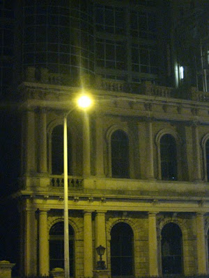
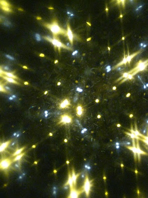
when into Hoabrt with my new Kalidoscope and tryed to take a few shots of the city through the Kilidoscope, but the images were a bit blured unfortunatly. Here are a few shots of what i manages to capture. This was done about 3 or so weeks ago if not earlier, just found them on my USB so though i best put them in.