Monday, May 2, 2011

Typography play


here is a little image I came across (cant remember were it was from sorry) but it got me thinking about the way in which i could use the letters from ITERATION / AGAIN as a paint brush tool to maybe draw city buildings?

Thursday, April 28, 2011

pinwheel folded flyers


Before coming across this wicked ass design for for a book store I wanted to have pinwheel flyers that would be distributed throughout Hobart and Launceston, in Cafe's stores gallerys? this would be part of my 'non-standard' promotion strategy and as my target audience is the family (as well as the art lituret and international visitors) this will be a fun design which to play with and learn about.

images from: www.behance.net

Monday, April 25, 2011

Glow-in-the-dark light trail


So this image got me thinking it would be totaly swell (parden the pun) if i could get some glow in the dark stickers or something and put them on the 4 points of the pinwheel and then go up to Mt Wellington at night place it in the wind (hopefully) and do a long exposure with Hobarts citylights in the background. This would enforsise the fact the transformation aspect of the rvent as well as iteration. Or even if i went across the bridge and took the photo there, replicating this image a little i guess. Although one a one coloured pinwheel would probably work best for this idea. Hmmmmmmm

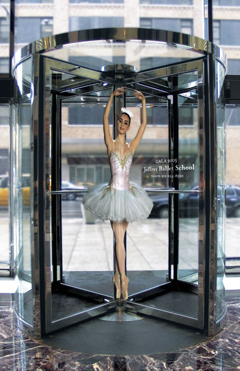
cleaver promotion


Ha This is rater cleaver way to advertise a ballay school> I was actualy thinking of using rotation doors as a place to stick an image of the pinwheel like on the flour right in the center of the pole that rotates the door. I know of the art school one and a family friends busyness has another one in town. Not sure about the main campus in Sandy Bay? I'm on the look out.

Other fun places i was thinking of sticking the pinwheel were places such as:

- Bus wheels

- On a clock in Hobart? ha maybe not umm...

- I did have a list but i managed to lose it. cant think of the other places at the mo.

Colour?


So i' thinking I still want colour and maybe a rainbow. - end of a rainbow treasure right. > come take part in Iteration/Again treasure waiting to be discovered. and not to mention my concept in braking the fact that it would be a holiday > a brake from the tiering everyday > "put some colour back in your life", "Stop and brighten up your day." > when the windmill stops the colours will be brighter. just for the record these aren't quoits from any where simply just catch phrases im tosing around. Colour wheel also has strong links to art.
So with the bottom colour wheel I was thinking instead of going with the primarys maybe some secondary colours or a mixture. The 4 that stand out the most for me would be the Red, pink, orange and yellow> nice warm colours.

the second wheel got me thinking maybe I use different shades of the one colour on the one pinwheel but change the colour in different promotion materials. The last one is obviously suggestive of having a colour fade as it goes round the pinwheel.


may be i could even play with the naming of colour, such as primary, fresh, new, tasmania, and have the names in small letters on each different colour and then have ITERATION AGAIN on the centre pin>??? what you recon little to litural? probably should suggest rather that state hey, but I dont know it would defiantly relatte many aspects strangely, with out been to intrusive and aspects that a design would otherwise no carry through as people don't read into designs they read what's on them.


Was also thinking that when the pinwheels folded there are actually not 4 but 8 different surfaces so i could try incorporating 8 colours instead of 4 > might be better.


Sunday, April 24, 2011

Windmilles in wind - slow shutter speed photos


Although I'm very grateful for Mi mate Rani to take these snaps for me they didn't really come out how I had invisioned. The coloured one isn't quite colourful enough - to much white and as the background looks like a Primary school it looks like a childs school project type thing. How ever i might play around with them on photoshop when i head into uni tomorrow. The silver one's might be more interesting if the pinwheel was a solid circular blure might have got a bit of an interesting reflection happening but otherwise i cant say i'm really loving the grey.


pinwheel colour experimenting


With the reflective ones i have tryed to see how reflective off their environment they are, but it would appear that its only when their held close to an object that it will reflect the colour. It may be that I just used kitchen foil and thats probably not the most clearly refective material so i could research other flexable reflective materials i guess. It's a rather space age look, jumps out from the forest surroundings like a sour thumb but probably would do the same in the ciry.

As for the burgendie and yellow i quite like those colours together but i'm not sure about having two colours maybe either One dominent colour or 4 or rainbow. Bright Yellow might be nice by itself. This one stands out from the background and would also stand out against the city landscape. I think i', heading towards colour over the reflective surface as i want bright fun colours the reflective one tipicly reflects black, grey and white, not really want that.